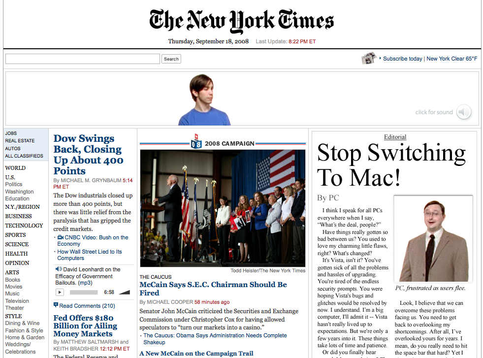
Awesome Apple Combo Ad
September 18th, 2008
Just saw this terrific combo ad on the New York Times for Apple where the 728×90 interacts incredibly well with a fat sky on the bottom right. I must say, I wish more advertisers would engage more with the content they are appearing on. I love how the ad is meant to look like a newspaper article, integrating quite well into the NYT homepage experience. I’m sure this cost them an arm & a leg to run, but it sure as hell grabbed my attention!


